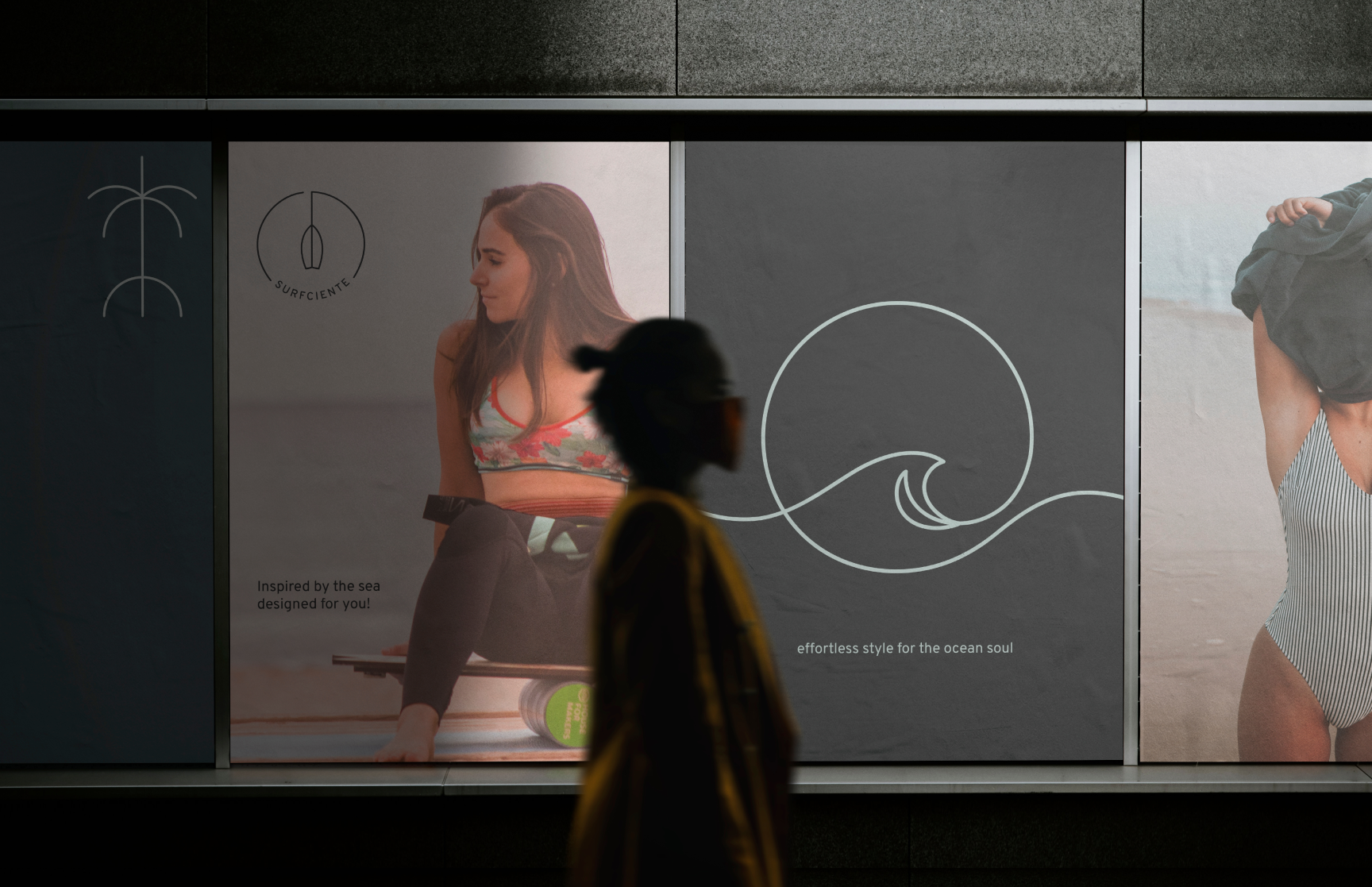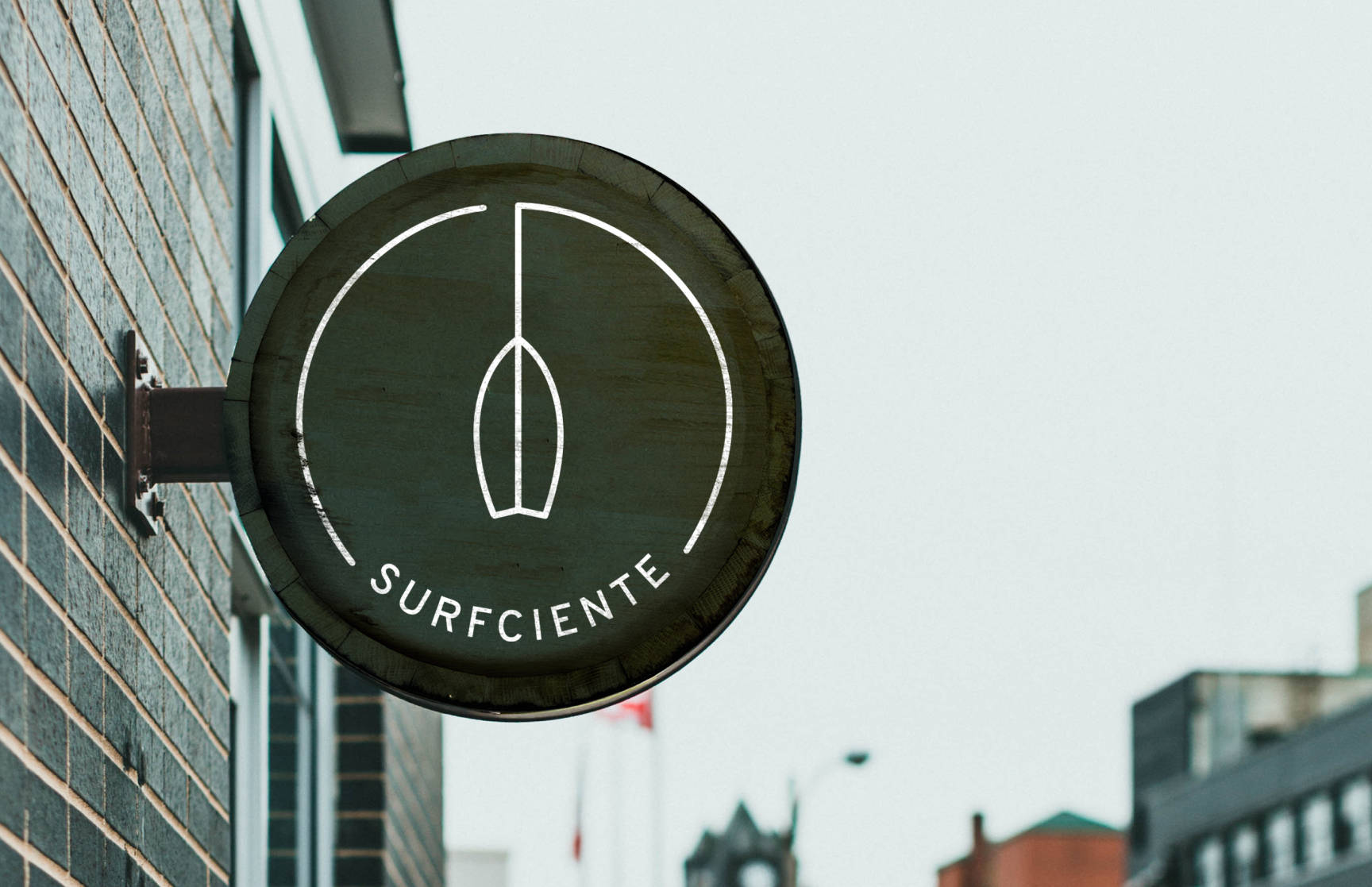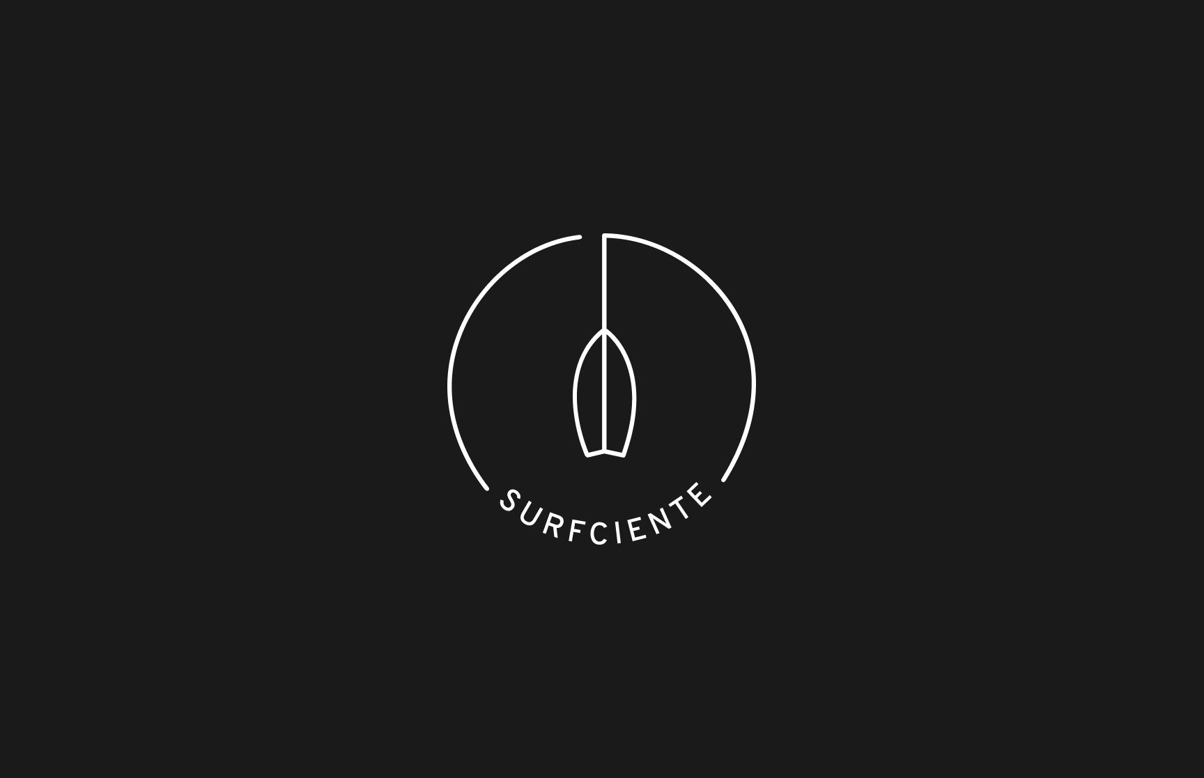
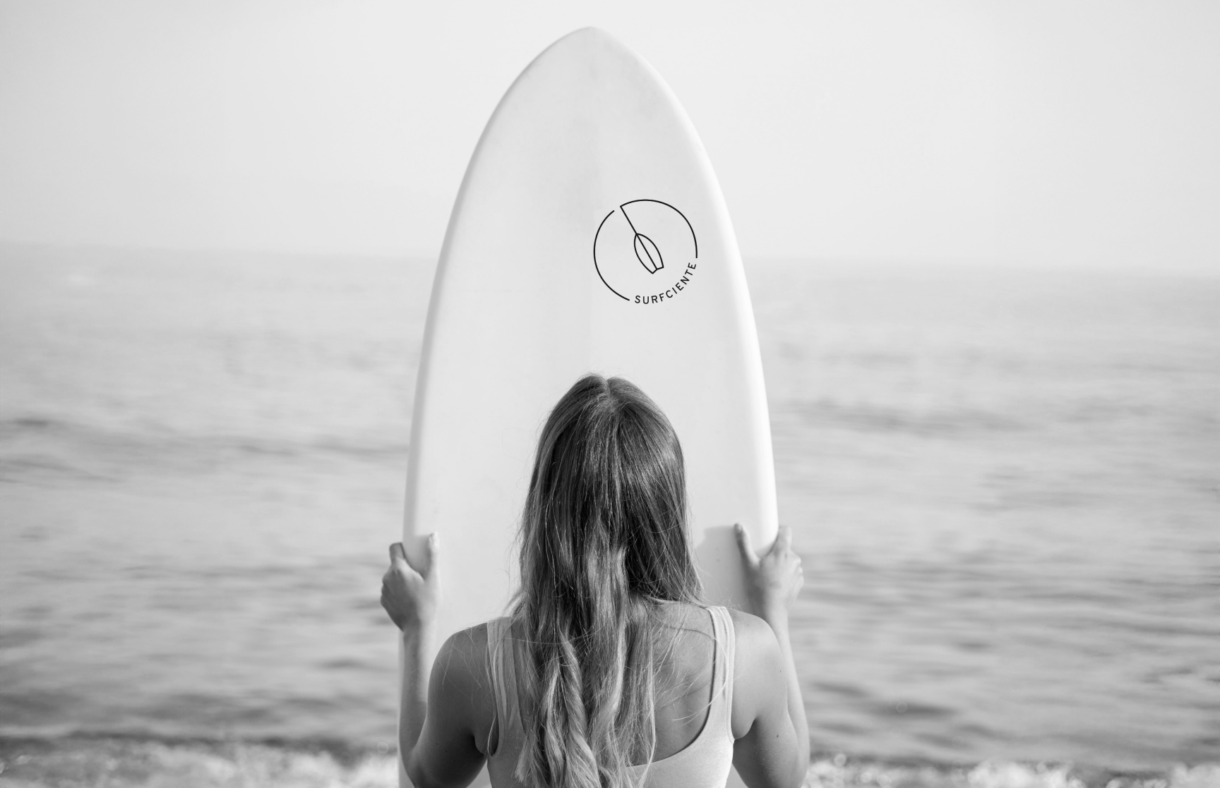
This is the logo I created for SURFCIENTE, a surfwear brand that’s all about keeping it real and riding the waves. It’s about to capture that ‘surf’s enough’ mentality!
I wanted to strip things back and go for a super clean, minimal design. The circle represents that sense of wholeness, that connection to the ocean, and the line with the surfboard shape inside speaks to that feeling of balance we all chase on the board and in life.
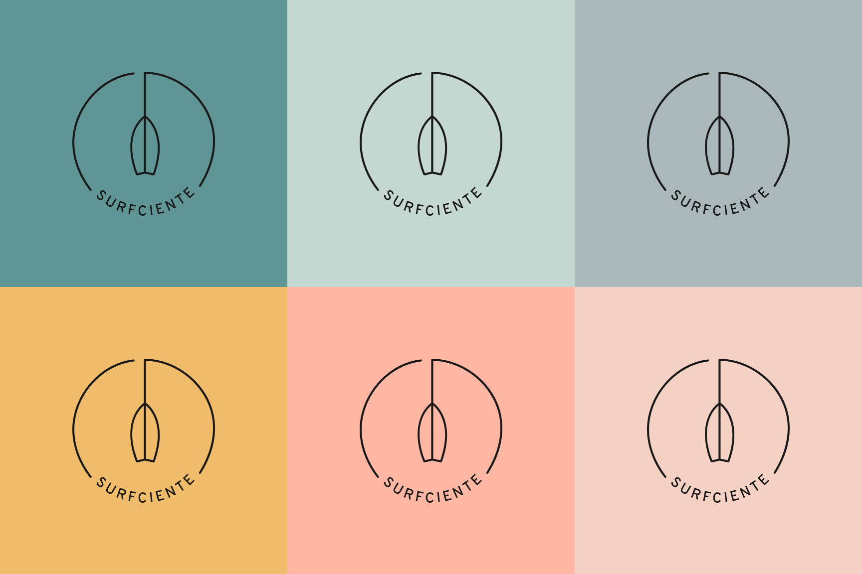
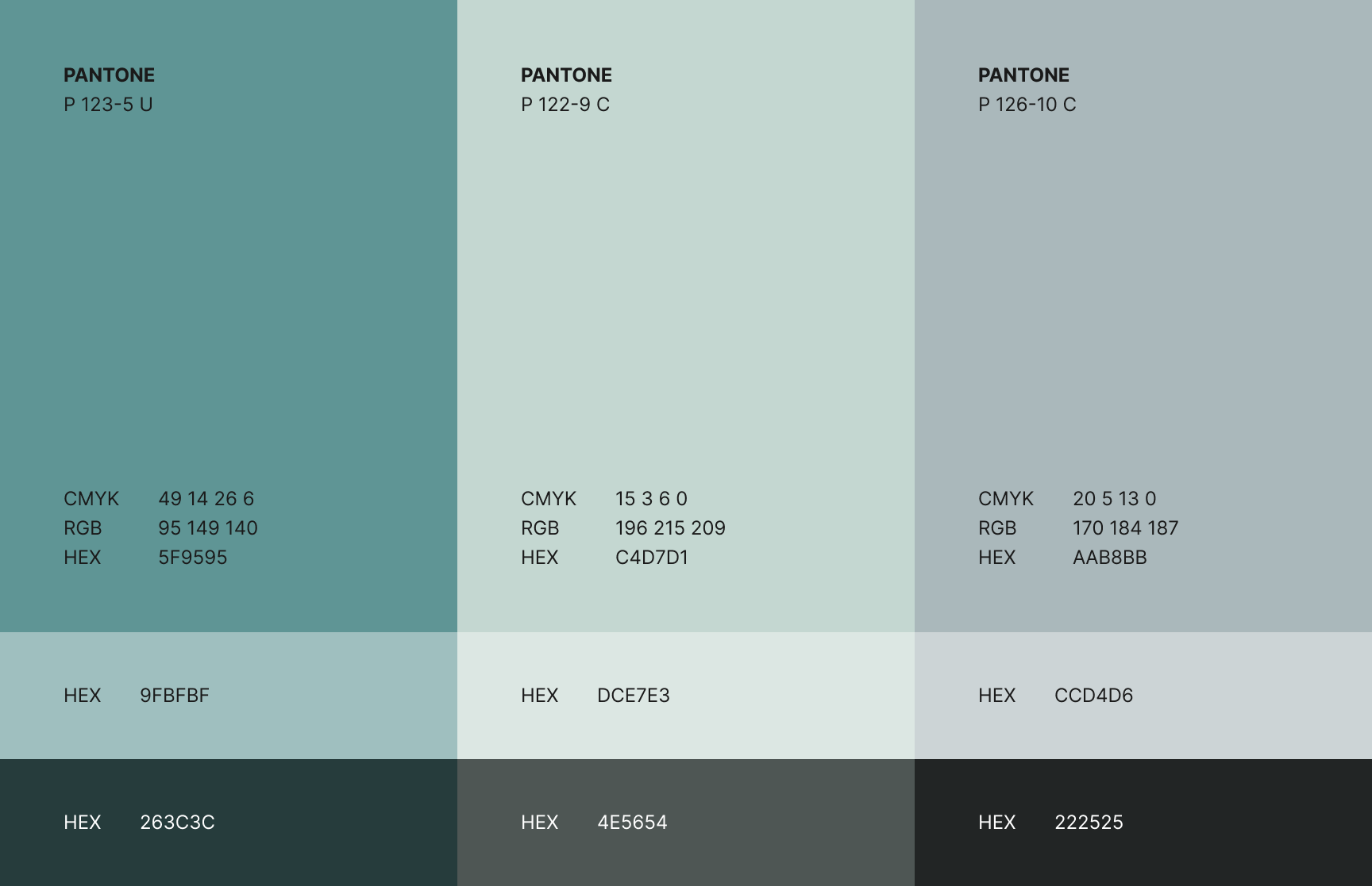
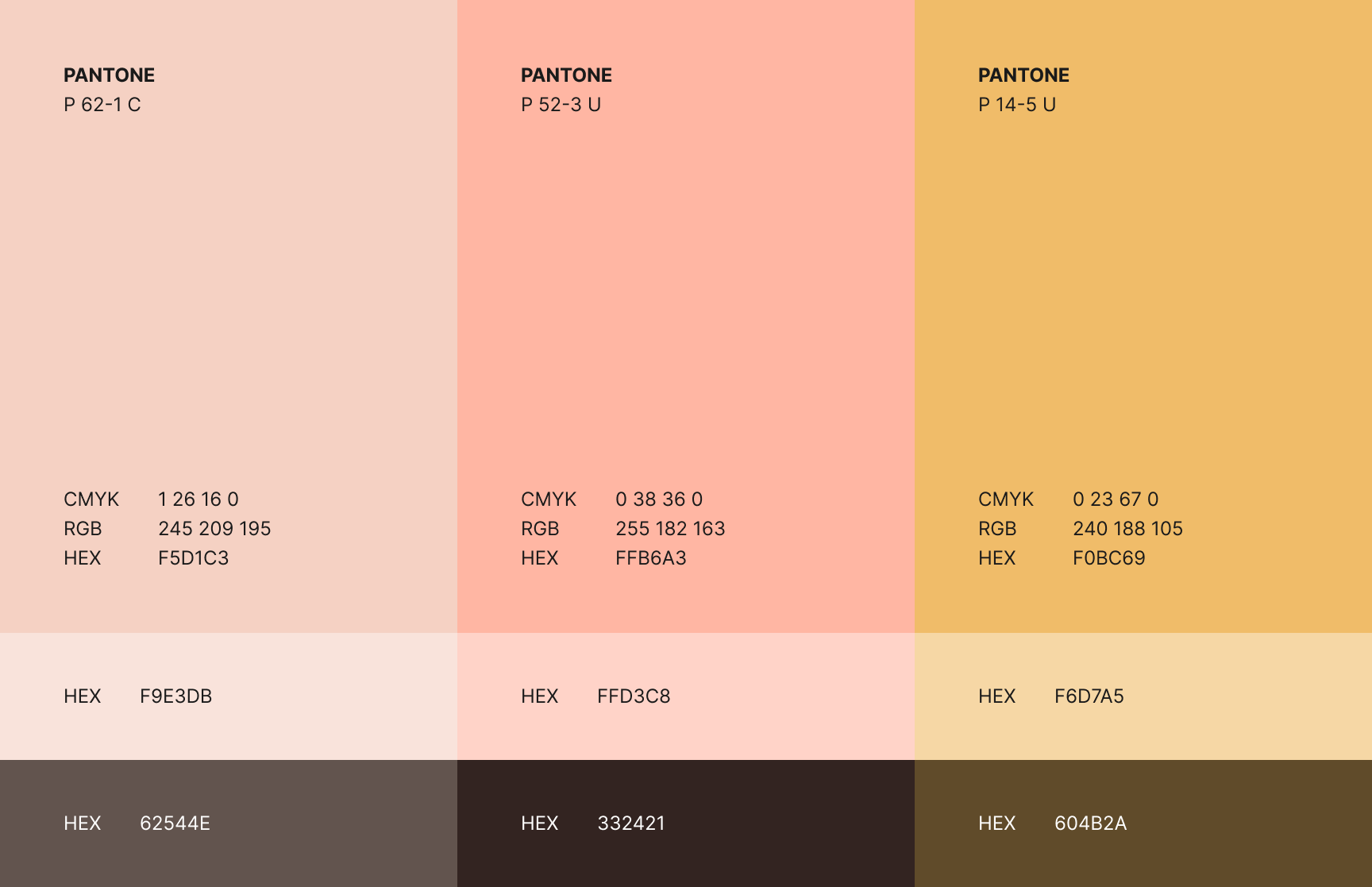
To capture that earthy, natural vibe that’s so essential to SURFCIENTE, I drew inspiration from the coastline itself. I’ve used a palette of muted greens reminiscent of seafoam and kelp, soft, greyish blue like the ocean on a misty morning, warm sand tones that evoke those sun-drenched beaches, and just a touch of rose to bring in a subtle warmth. The color palette evokes that relaxed, laid-back surf lifestyle.
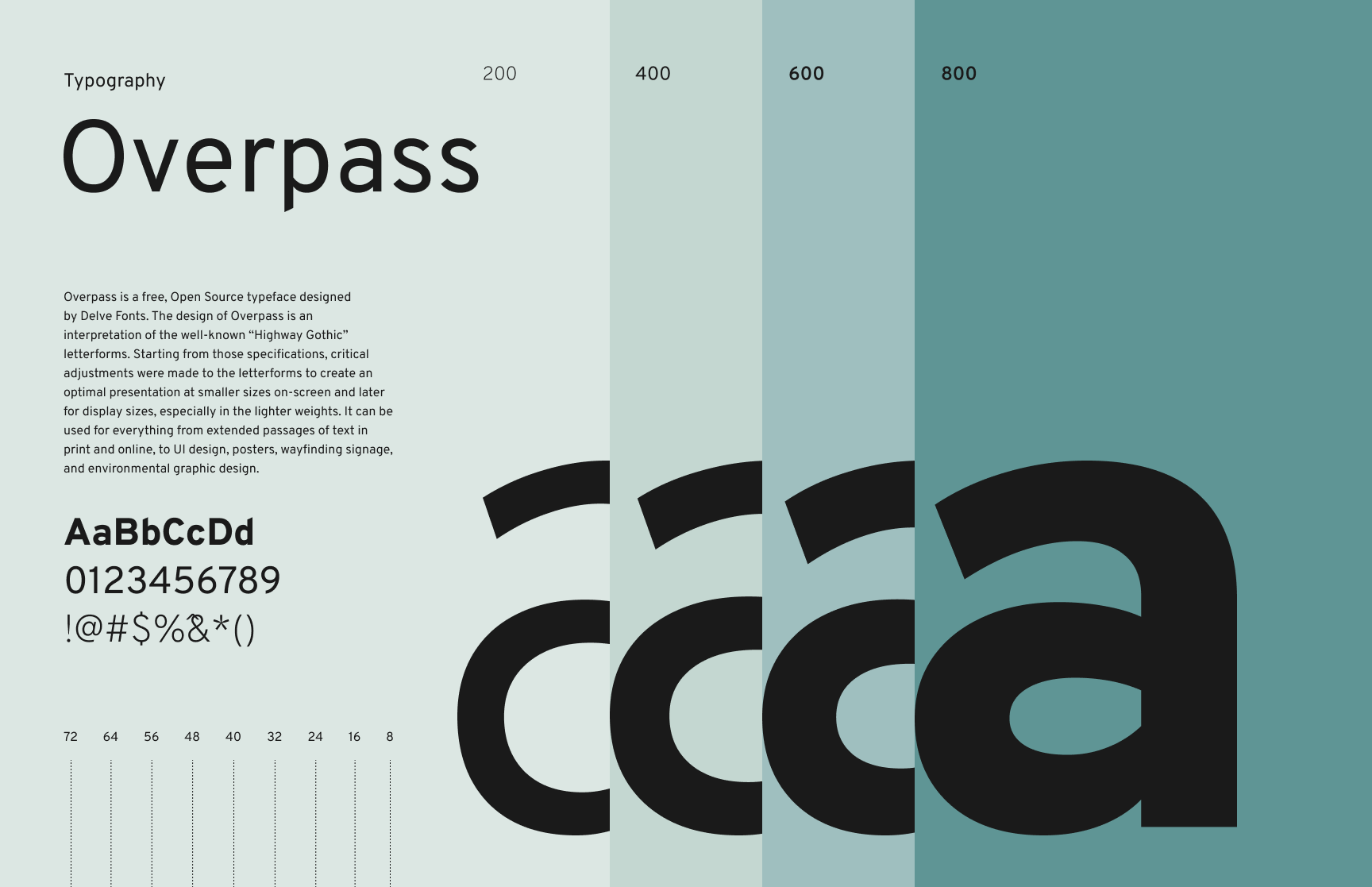
And to complement that vibe, I chose Overpass for the typeface. It’s modern and easy to read, nothing too flashy. It complements the icon perfectly and works across all kinds of media, from t-shirt labels and board graphics to website headers and even billboard ads.