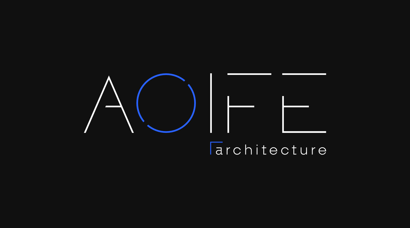
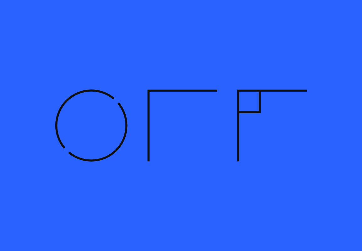
I went for a super clean, minimal vibe with this architecture studio’s identity, which really captures the precision and clarity of their work. The typeface is geometric and bold, with sharp, angular lines that just scream “structurΞ”. The “Λ” kind of mimics the shape of a roof or building facade.
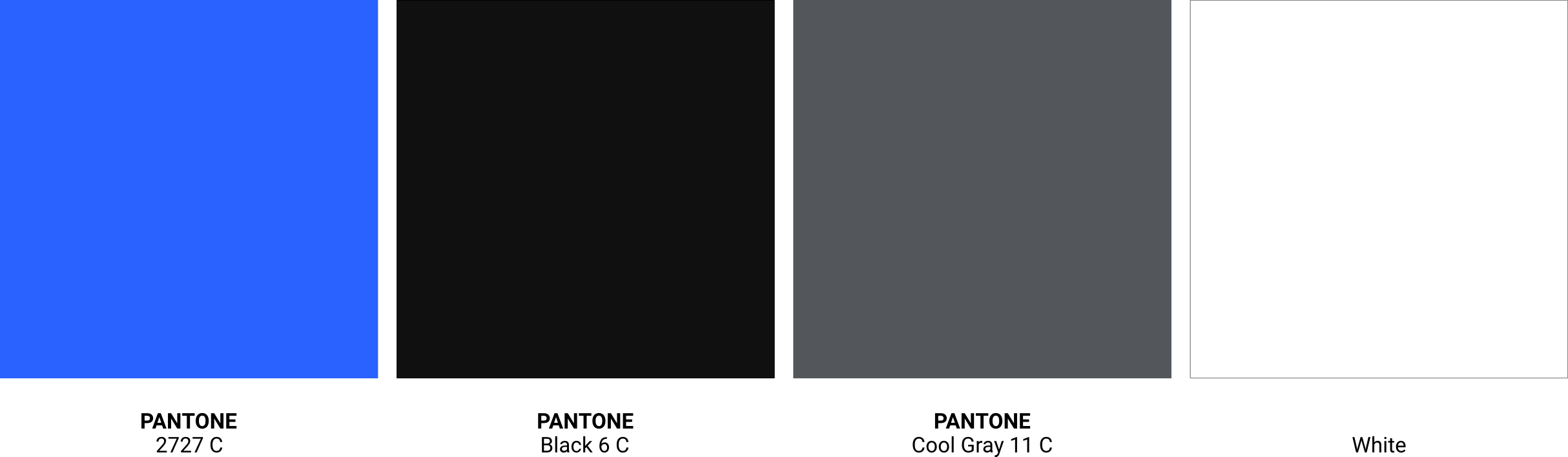
For the colors, I kept it simple: Pantone 2727 , Black 6 C, Cool Gray 11 C and White.
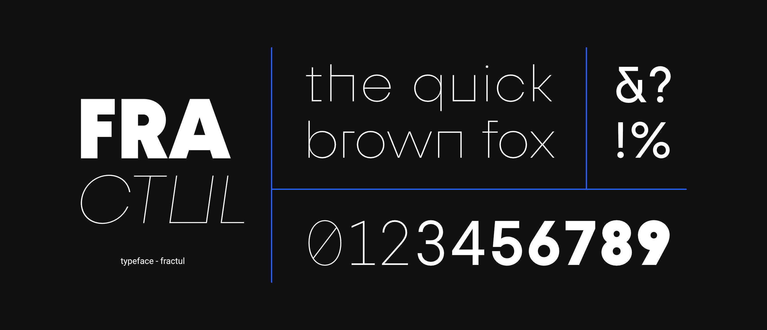
For the tagline ‘Architecture,’ I chose Fractul because it perfectly captures what Aoife’s architecture is all about. Its geometric shapes and sharp lines give off a strong, stable vibe, kinda like a well-built skyscraper. And the whole geometric thing speaks to that balance and harmony you see in their work. It’s a typeface that looks sharp and also subtly shows those core values that Aoife brings to architecture.